This morning (9th October 2014) was not like any other morning. Usually I wake up and check my nightly email while having my breakfast. This morning, however, I awoke to my work email account having just fewer than 3,000 unread emails waiting for me. During the night someone on the UCL Students email list had worked out how to send an email from the provosts email account to the all students mailing list saying the single word “bello”. What’s unclear was that this email appeared to come from the Provost’s alias and no-one knows if the account was hacked (which would signal a breech of an account) or just some student on campus who knew how to spoof the email headers.

No one knows exactly what has happened, and this is only speculation, but what I think has happened is that the general mailing list for all students has been setup incorrectly allowing anyone with the email address to send to any message to the student body. Until an official statement has been announced we won’t know for certain.

Naturally my first reaction was to start to read all of these emails and see what was being said between the students to get an understanding of how they were using service. We had emails from students who were saying “hello” or “bello” in some cases, many students responded to the mailing list saying “Please remove my name from the list”. My favourite of all these emails were the mailing lists that the mailing list alias (the One Direction Fan Club and the along with a poem about the event:

There once was a hack with a bello
Done by a peculiar fellow
He sent it to all
You might even call
It a cry for a friendly hello

As of 9:30am the mailing list was closed down and an investigation is underway according to the @uclnews twitter account. @uclisd have done a great job keeping everyone notified even to the point of apologising to all the students via a text message to mitigate any concerns.

So what happens when you are researching ways to deal with unstructured textual data, have a toolkit, which collects data from various services and access to all the emails that were sent? Obviously you analyse the data! I quickly wrote some software to pull the data into the Big Data Toolkit and processed the data. I stripped out all identifying details such as email address and analysed only the date, time, subject heading and message body for information on what was being discussed. Below is a short breakdown of the data processed by my Big Data Toolkit.

The Data

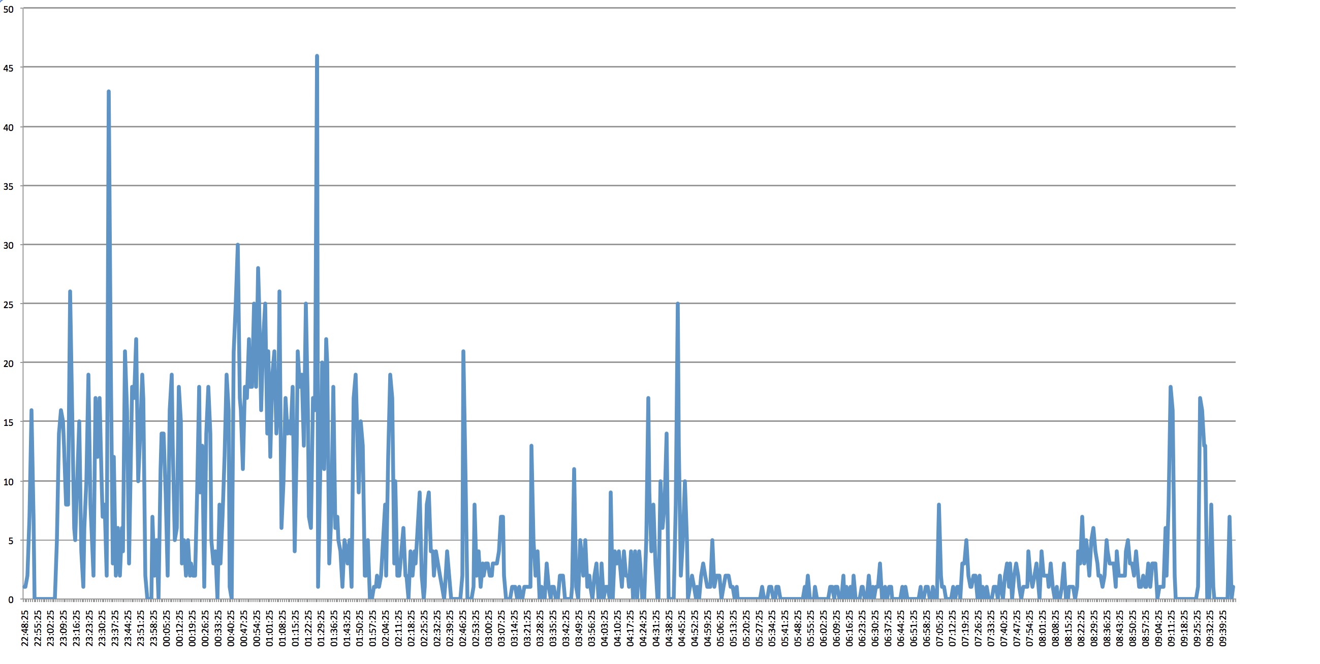
2,968 emails were sent out during the spam attack. Assuming that there is 26,000 students at UCL (from 2012 stats) then the total load on the email servers was 71,168,000 messages sent over a period of 11 hours.

First Email Sent: Wed Oct 08 2014 22:48:25 GMT+0100 (BST)
Last Email Sent: 09/10/2014 09:45:41 GMT+0100 (BST)
Total Period: 10 hours 57 minutes
Total Size of all 2,968 emails: 85.61 Mb
Total Data storage for all students: 2.226 Tb
Emails which were Subscriptions (Mailing Lists): 1,254

Distribution of sent messages (every minute)

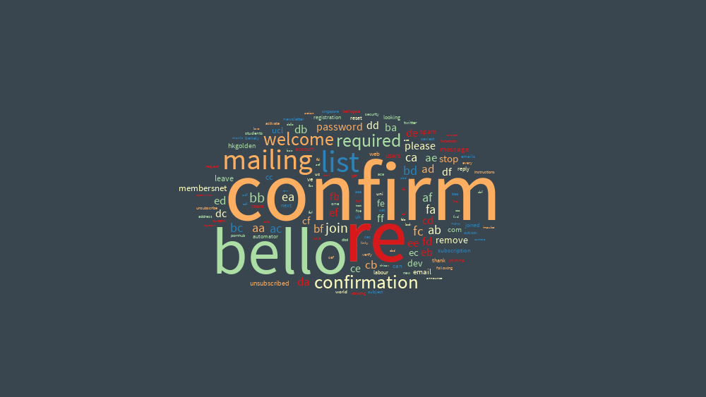
Textal of Subject Headers (view on textal.com)

A few years back while I was a researcher at the Department od Computing Science, Glasgow University we purchased 2 small Nabaztag rabbits to augment our prototype multimodal navigation system. The rabbit announced instructions for the users to search the map to find different locations around the world – a sort of digital treasure hunt. Fast forward 7 years and I’m doing it again.

The Karotz, the new name for the rabbit, is a special interactive device. It has ears that you can position, an LED in it’s belly that you can set to various colours, a microphone so you can give the rabbit commands, a speaker to play music either remotely or from a USB stick which can give the rabbit a voice, a nose to smell out those pesky RFID tags and a new feature that’s different from the older rabbits, a webcam to see.

We’ve bought another 2 rabbits for our research at CASA and we’ve been having a think about how we can use them to brighten up the office. For the first few months we had some issues with our corporate WiFi network, think blocked ports and firewalls, so actually getting the rabbit to talk to the outside network has been a challenge. By setting up a 3G router in the office we’ve been able to have more control of our Internet of Things devices and this has meant that we can make these devices respond to some of our collection software.

Once we got the rabbit connected, I decided the first thing we had to do was make the Karotz API friendlier to developers. I set up a small web server written in Node.JS on an internal server where we could send commands to the rabbit and it would proxy these authenticated commands to the Karotz API, which in turn sends to the rabbit.

For example if you want to set the ears to down then you would call the following web service:

http://localhost:9000/ears/9/9 

To set the LED to red you would call:

http://localhost:9000/led/ff0000

And to make the rabbit talk you would call:

http://localhost:9000/speak/Hello%20World

Oliver O’Brien had the idea to attach real world London Underground Tube alerts to the rabbit so I set up a command on the server to make the rabbit announce the tube alerts (which you can see on the video below)

http://localhost:9000/status/ff0000/The%20Central%20Line%20Is%20down

These types of ubiquitous technologies allow developers to integrate real time data into our lives without users having to log onto computers or get our mobile phones out to actively check on services. We are just starting to explore the possibilities of this technology so stay tuned for some more of cool little side projects.

Many maps use overlays to display different types of features on the map. Many examples show old hand drawn maps that have been re-projected to fit on our modern day, online ‘slippy’ map but very few show these overlays over time. In this tutorial we are going to explore animations using the Google Maps iOS SDK to show the current live weather conditions in the UK.

The Met Office is responsible for reporting the current weather conditions, issuing warnings, and creating forecasts across the UK. They also provide data through their API, called DataPoint, so that developers can take advantage of the live weather feeds in their apps. I’ve used the ground overlays from DataPoint to create a small iOS application, called Synoptic, to loop around the real-time overlays and display them on top of a Google Map, very handy if your worried about when it’s going to rain.

Finished App and Source Code

I always find it interesting when these tutorials show you what we’re going to create before digging deep into the code so here is a small animation on the right of the page of what the end product should look like.

What you’re looking at is the real-time precipitation, or rain, observations for the UK on Sunday 19th January 2014. It’s been quite sunny in London today so much of the rain is back home in the North. You can grab a copy of the code for this tutorial from GitHub.

Read on →

At UCL CASA our main focus of research is cities and how, as a population we use our cities daily. My main interest is discovering and analysing the hidden city through our daily interactions on social media, blogs, and crowd sourcing data that’s not currently available. We recently held a 2 day conference at CASA (1 day of workshops and 1 day of talks) teaching attendees the skills and tools to visualise these types of datasets.

My workshop was all about Data Hacking and collecting real time data from Twitter. We had around 70 budding data scientists learning how to collect data from Twitter using Node.js and then visualising that data on Google Maps Engine. Here are the slides (and also embeded at the end of this post) from the event so that you can try it out yourself at home and get your hands dirty with some raw Twitter data.

Read on →

Hello and welcome to my new blog. I’ve been blogging for a few years in several places but I felt the time had to come to consolidate all the blogs to one location and give me a single place to share some of my views, some of my research and most importantly, hopefully, teach you something new. So before I start blogging I thought I’d tell you a bit about myself.

I’m Steve and currently work as a Researcher at the Center for Advanced Spatial Analysis at UCL (University College London). I originally come from just outside Glasgow, Scotland but have taken the long trip south for tropical climates and ended up living in London. My current research focuses on distributed high performance computing and analysing large datasets in real-time (while mapping the results!). In my spare time you can find me walking long distances, climbing mountains, composing music or playing the piano or trumpet.

In recent years I have specialised on building mobile applications (mainly iOS) and systems that open up the world of data visualisation, mining and analysis to the masses. I can sometimes be found on StackOverflow answering questions about Google Maps API and the iOS SDK, and answering MacOS problems. In addition to this I give lectures and workshops to academics and industry partners on using Google Docs and Fusion Tables to create compelling visualisations to showcase on Google Maps and Google Earth.

Read on →